Slots and Component Composition Svelte
Jul 31, 2023Arkar
Svelte
Slots, named slots, and slot props, the article also covers slots to create even more dynamic and flexible components in Svelte.
On this page
Let’s talk about component slots and how you can create dynamic and reusable components in Svelte.

In React, to create a reusable component, you might use something like this.
function Card(props) {
  return (
    <div className="card">
      <div className="card-header">
        {props.title}
      </div>
      <div className="card-body">
        {props.children}
      </div>
    </div>
  );
}

function App() {
  return (
    <Card title="My Card">
      <p>This is the content of my card.</p>
    </Card>
  );
}
The Card component has a title prop and a children prop, with the latter rendering the content of the card body. To use it in the App component, simply pass the content as a child element.
Slots in Svelte
Svelte has a different way of making reusable parts. Instead of passing data from parent to child using props, you can use component slots. These slots let you take and show any children within a component. So, you can give any content as a child and it will appear in the component.
<!-- Card.svelte -->
<div>
  <slot>
		<!-- Fallback Slot -->
    this fallback content will be rendered when no content is provided, like in the first example
  </slot>
</div>

<!-- App.svelte -->
<!--  component with the default content -->
<Card />

<!-- child elements will render -->
<Card>
  <p>this is some child content that will overwrite the default slot content</p>
</Card>
Fallback Slots
In Svelte, you can show alternative content for your component slots. This content will show up when no content is given for a slot. To show alternative content, just add the content you want to display inside the <slot> tag. This content will display if no content is given for the slot.
Named Slots in Svelte
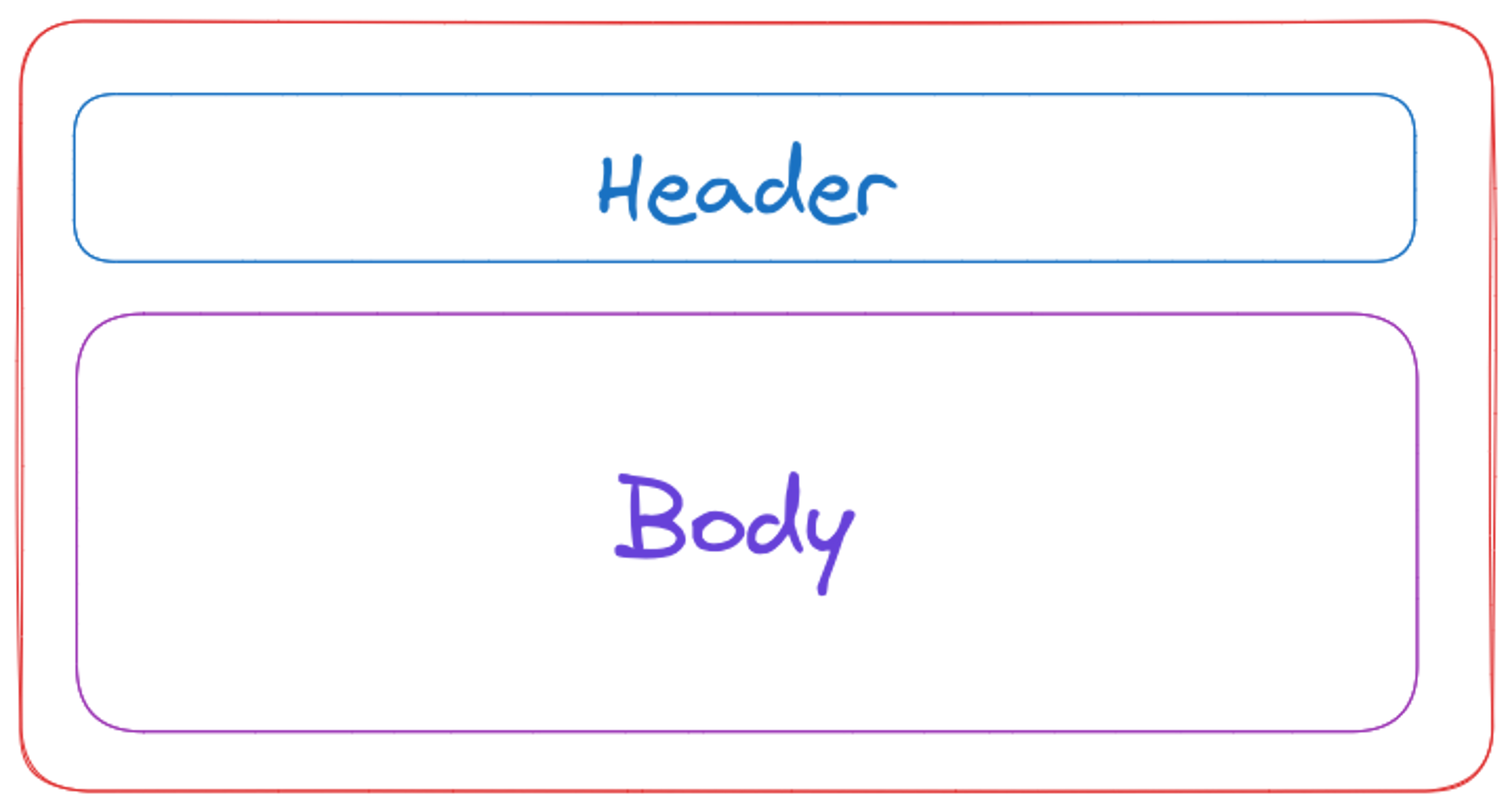
Named slots in Svelte provide a huge advantage when it comes to making your components flexible and reusable. With named slots, you can easily pass different content to different slots in the same component.
<!-- Card.svelte -->
<div>
  <slot name="header">
    <!-- Fallback Slot for Header -->
    <div class="card-header">Default Header</div>
  </slot>
  <slot name="body">
    <!-- Fallback Slot for Body -->
    <div class="card-body">Default Body</div>
  </slot>
</div>

<!-- App.svelte -->
<Card>
  <h2 slot="header">My Card Header</h2>
  <p slot="body">This is the content of my card.</p>
</Card>
Svelte also have a way to group multiple elements together without creating a new DOM node. Fragments are useful when you want to return multiple elements from a component without adding an additional DOM node.
<!-- App.svelte -->
<Card>
	{#each items as item}
	  <h1 slot='header'>{item.title}</h1>
		<svelte:fragment slot="body">
	    <p>{item.description}</p>
		  <span>
				{item.createdAt}
			</span>
	  </svelte:fragment>
	{/each}
</Card>
$$slots
$$slots is an object that has the names of the slots sent to the component by the parent. If the parent doesn't send a slot with a specific name, that name won't be accessible in $$slots. This allows components to display a slot (and other elements, such as wrappers for styling) only if the parent provides it.
In this example below, the hr component will not get render when there is no description component provided.
<!-- Card.svelte -->
<div>
  <slot name="title" />
  {#if $$slots.description}
    <!-- This <hr> and slot will render only if a slot named "description" is provided. -->
    <hr />
    <slot name="description" />
  {/if}
</div>

<!-- App.svelte -->
<Card>
  <h1 slot="title">Blog Post Title</h1>
  <!-- No slot named "description" was provided so the optional slot will not be rendered. -->
</Card>
You can also combine with class directives to create more dynamic and flexible components.
<article class:has-discussion={$$slots.comments}>If you want to know more about directives check out my other article on directive in Svelte .
Slot Props
In Svelte, you can send data to the parent component using slot props. Slot props allow you to set a group of properties that the child component can send to the parent component. This is useful when you need to provide a way for the parent component to access data created by the child component.
<!-- App.svelte -->
<Card let:counter={counter}>
	<h1 >Double : {counter * 2} </h1>
</Card>

<!-- Card.svelte -->
<script>
  let counter =0;
	function handleClick(){
		counter = counter + 1;
	}
</script>

<div>
	<h1>Counter : {counter}</h1>
	<!-- passed the value back to parent -->
	<slot counter={counter}/>
	<button on:click={handleClick}>Add + 1</button>
</div>
Thank you for your time. Hope this is useful for your Svelte journey. I'll be adding new articles on Svelte and stay tuned for more!
Subscribe to my newsletter
Join my web development newsletter to receive the latest updates, tips, and trends directly in your inbox.
On this page

